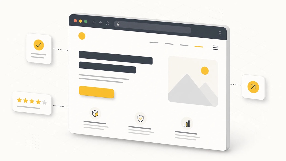
A landing page is a standalone page built around a single goal, a single offer and a single call-to-action (CTA). Unlike a general website, it has no menu, side links or distracting elements; it takes a visitor coming from an ad, an email or social media straight to conversion (filling a form, buying, signing up). This guide covers the 10 design principles that actually move conversion rate, real-world examples and the mistakes that hurt performance most.

- A landing page runs on a single goal, single CTA logic; every extra link that adds hesitation lowers conversion.
- The headline must answer "why am I here?" within the first 3-5 seconds, or the visitor leaves.
- Mobile load speed and form length are the two most concrete technical factors affecting conversion.
- Social proof (reviews, logos, numbers) and trust signals reduce hesitation, especially for first-time visitors.
- Even the best landing page is never finished; it improves continuously through A/B testing and data.
What Is a Landing Page?
A landing page is a standalone page a visitor reaches after clicking an ad, an email campaign link or a social media link, built around a single purpose. In Turkish, the terms "land page", "landing sayfası" and "açılış sayfası" all refer to the same concept, different spoken variants of the English "landing page".
A landing page's job is not to inform, but to drive action. That's why it is designed far more sparsely than a corporate website: one headline, one offer, one CTA, and only the minimum content needed to support that decision. Navigation menus, outbound links and unrelated information are usually removed on purpose, because every extra option increases the chance the visitor drifts away from the main goal.
Landing Page vs. Website: What Is the Difference?
The core difference is purpose: a website presents a brand across many angles, while a landing page carries a single offer toward a single goal. A website offers free navigation and many pages; a landing page deliberately channels the visitor's attention down one path.
- Purpose: A website informs and presents broadly; a landing page focuses on one conversion goal (sale, sign-up, quote request).
- Navigation: Websites have rich menus and internal links; landing pages usually have no menu, or a minimal one.
- Traffic source: Websites draw traffic from many channels (organic search, direct); landing pages are usually tied to a single campaign (Google Ads, email, social ad).
- Measurement: Websites track multiple micro-goals; a landing page has a single central metric, the conversion rate.
What Should a Good Website Look Like?
A good website loads fast, works well on mobile, has a clear navigation structure, carries trust elements (references, contact details, security certificate) and is technically sound for search engines. A landing page is a narrower, sharper application of these same principles, focused on a single goal rather than a full site. Ongoing on-site SEO work on your main site also directly affects how well individual landing pages perform.
10 Landing Page Principles That Boost Conversion
The 10 principles below list the elements that most affect conversion rate on campaign landing pages, in the order a visitor typically moves through the page, from arrival to clicking the CTA.
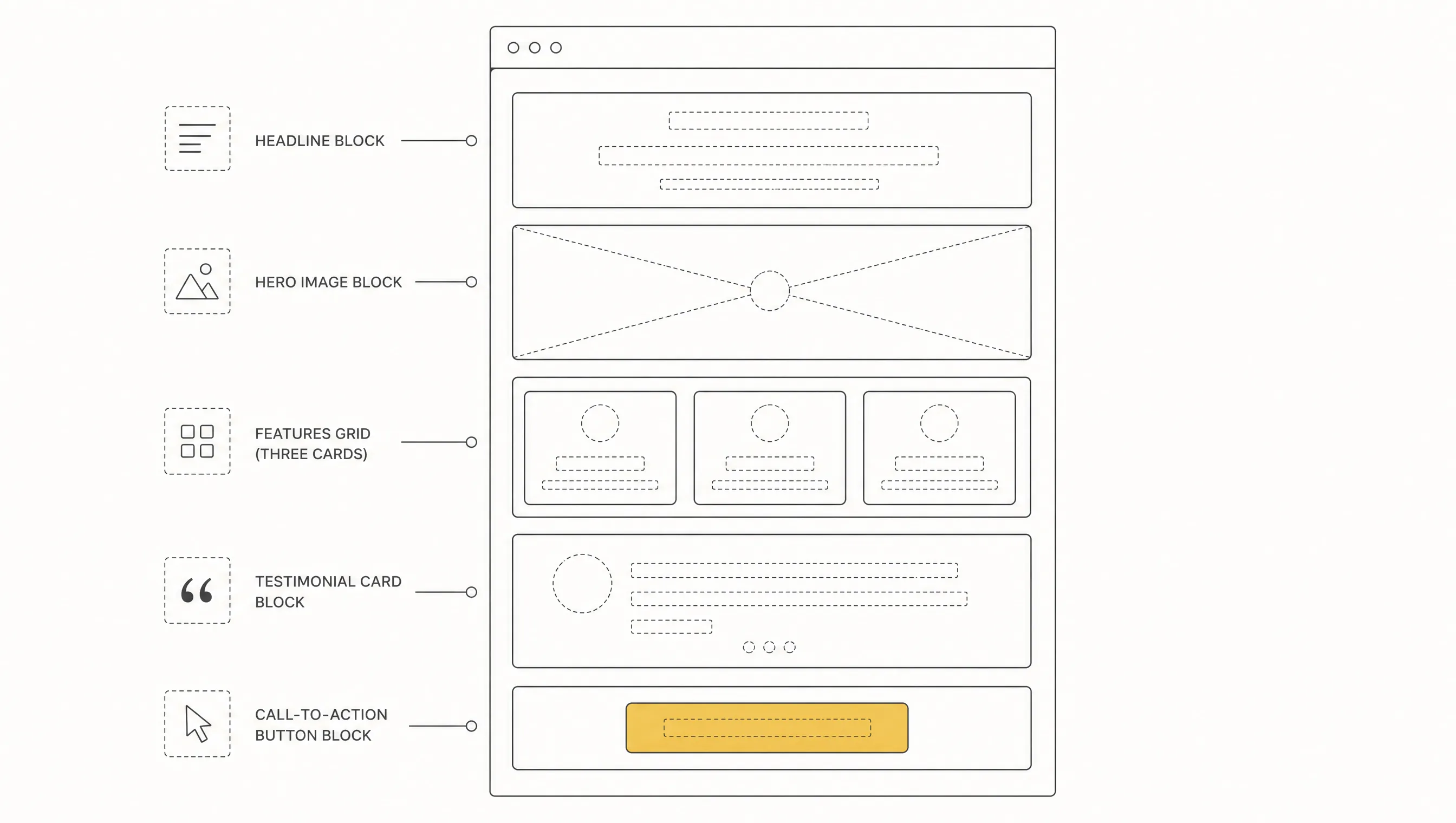
1. One Goal, One Call-to-Action
A landing page should have only one primary action: "Get a Quote", "Try for Free" or "Buy Now". Offering more than one competing CTA (for example both "sign up" and "download the brochure") creates hesitation and lowers conversion. The same CTA can repeat several times down the page, but the message must stay identical.
2. A Clear, Strong Headline (Value Proposition)
Within the first 3-5 seconds, the visitor should see the answer to "what's here for me?" The headline should describe the problem solved or the outcome delivered, not just the product name. Vague, generic headlines fail this job.
3. Critical Information Above the Fold
The area visible without scrolling should contain the headline, a short description and the CTA. Forcing the visitor to scroll before they can decide anything is one of the most common causes of early drop-off. Supporting detail belongs below this first block.
4. Speed and Mobile Performance
Every extra second of load time measurably lowers conversion, and the effect is sharper for mobile traffic coming from ads. The page should be built with compressed images, minimal third-party scripts and a mobile-first layout.
5. Social Proof (Testimonials, Logos, Numbers)
Customer reviews, recognizable client logos or concrete figures ("10,000+ users", "4.8/5 rating") reduce trust gaps, especially for visitors seeing the brand for the first time. Specific, verifiable proof works far better than vague praise.
6. A Frictionless Form
The fewer fields a form has, the higher its completion rate. Ask only for information that is genuinely necessary, usually name, email, phone; every extra field is a potential drop-off point. If a field is optional, say so clearly.
7. Visual Hierarchy and White Space
The eye moves through a page in a set order: headline, image, description, CTA. Without enough white space, that hierarchy breaks down and the visitor can't tell what to focus on. A clean layout converts better than a crowded one, consistently.
8. Trust Signals (Security, Guarantees, Transparency)
An SSL badge, a clear refund or guarantee policy, real contact details and a privacy policy link directly affect conversion, especially on pages involving payment or personal data. Missing these signals often causes visitors to abandon at the last step.
9. A/B Testing and Data-Driven Improvement
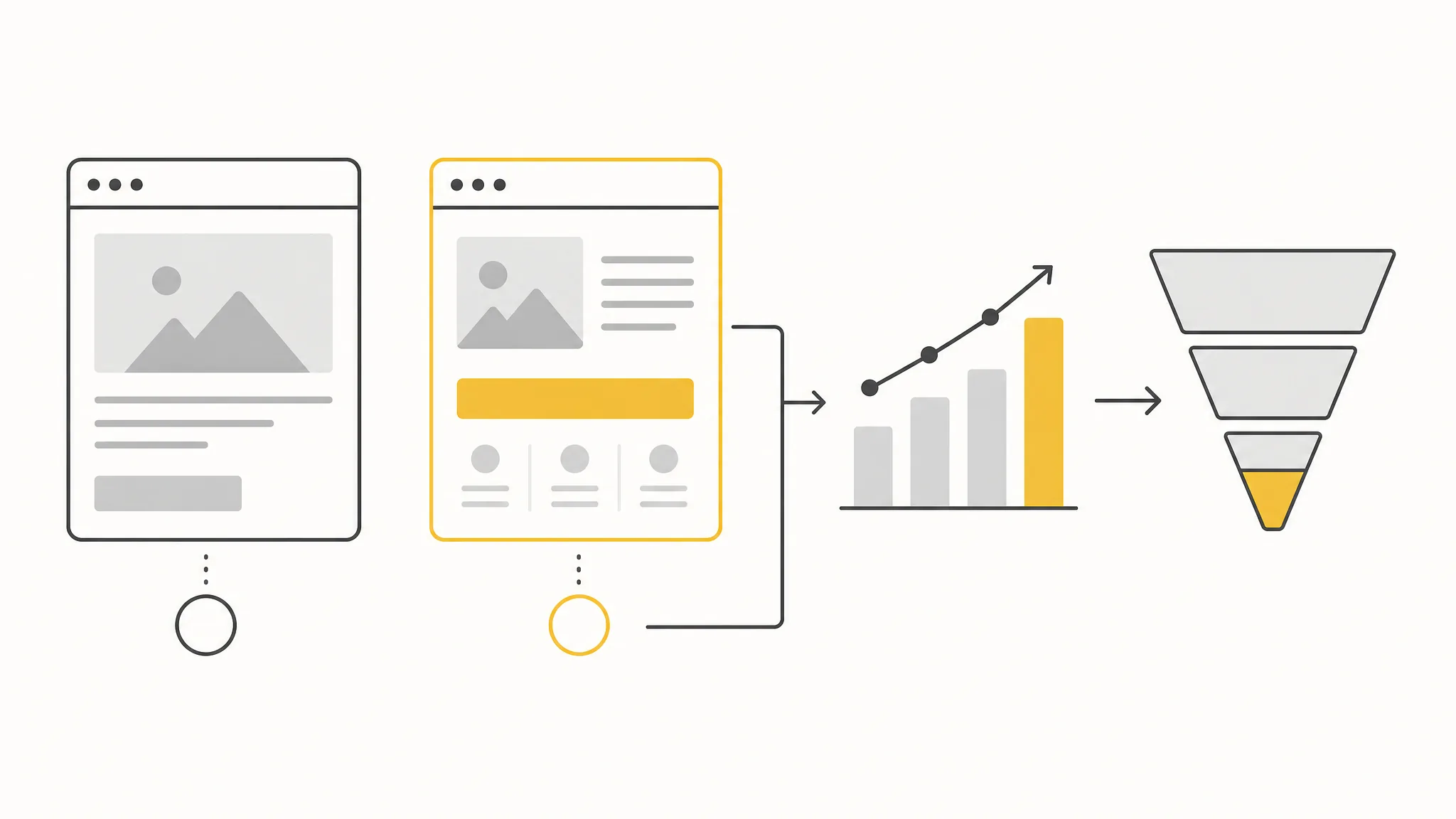
Even the most experienced designer can't know for certain which headline, button color or form length will perform best. That's why a landing page should be treated not as a one-time deliverable, but as a live asset under continuous testing.
10. Clear, Consistent Messaging (Message Match)
When a visitor clicks an ad, they expect the landing page to show the exact same offer, language and imagery. A mismatch between the ad and the page creates a "wrong place" feeling and drives an immediate bounce. The campaign, the ad copy and the landing page should always carry the same promise.
Landing Page Examples: How Different Industries Use Them
Landing pages are used across nearly every industry, each with a different conversion goal; what stays constant is the single-offer, single-CTA logic.
- E-commerce campaign page: Built around a specific product line or discount, with a direct add-to-cart CTA.
- Google Ads landing page: Answers one specific search query directly, with high message match to the ad copy.
- Webinar or event registration page: Highlights date, speaker and benefit, with a single "register" CTA.
- SaaS free-trial page: Summarizes the core product benefit and routes to a "start free trial" or "request a demo" CTA.
- Service quote page: Common in B2B, focused on a "get a quote" or "book a call" form, backed by references and case studies.
Common Landing Page Design Mistakes
Most conversion-killing mistakes come from breaking one of the 10 principles above. The most common ones:
- Multiple competing CTAs: Offering three different actions at once usually means none of them get completed.
- Overly long forms: Asking for unnecessary fields (job title, company size, budget range) up front lowers completion rate.
- Ad-to-page message mismatch: When what's promised in the ad differs from what's shown on the page, visitors lose trust.
- Slow load times: Unoptimized images and unnecessary scripts lose visitors, especially on mobile, before the page even loads.
- Broken mobile layout: Pages designed desktop-first and poorly adapted waste the majority of traffic, which is usually mobile-heavy.
- Missing social proof: Pages with no references or numbers fail to build trust, especially with new visitors.
How Does the Landing Page Design Process Work?
An effective landing page is not a random design decision but a process built around a goal. The process we follow at Ilegra:
- Define the goal and audience: Clarify the page's single conversion goal and the visitor profile that will reach it.
- Build the message and offer: Write a headline, subheadline and CTA copy that match the ad or campaign exactly.
- Wireframe and content hierarchy: Plan what goes above the fold and what supporting detail goes below.
- Visual design: Build a visual language aligned with the brand that doesn't distract from the goal.
- Development and speed optimization: Code the page mobile-first, with high performance in mind.
- Launch, measurement and A/B testing: Publish the page, track conversion rate, and improve it based on data.
A landing page's success comes less from a one-time design deliverable and more from a system built around a campaign goal and measured continuously. If you're unsure whether you need a broader website refresh or a dedicated landing page for a specific campaign, learn more about our web design service or get in touch with us directly.
Frequently Asked Questions
What is a landing page?
A landing page is a standalone web page a visitor reaches after clicking an ad, an email or a social media link, built around a single offer and a single call-to-action to drive one conversion goal, such as filling a form, buying or signing up.
What does "land page" mean?
"Land page" is a shortened, commonly used variant of "landing page" in Turkish, referring to the same concept: a single-goal landing page.
What does "landing" mean on its own?
"Landing" on its own also refers to a landing page; it is commonly used as shorthand in conversation or campaign briefs.
What should a good website look like?
A good website loads fast, works well on mobile, has a clear navigation structure, carries trust elements and is technically sound for search engines. A landing page is a narrower application of these same principles, focused on a single goal.
What is the difference between a landing page and a website?
A website presents a brand broadly and includes many pages, menus and internal links; a landing page carries a single offer toward a single goal, usually without a menu and tied to one campaign.
How long does landing page design take?
Timeline depends on how clear the goal is, content readiness and integration needs. A simple, single-section campaign page can be finished in a few days, while pages needing form integrations and multiple tests can take a few weeks.